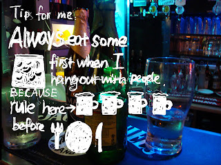
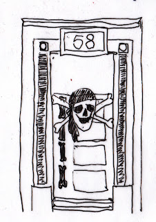
sign in the toilet
Thursday, 28 October 2010
Saturday, 16 October 2010
Saturday, 9 October 2010
Thursday, 27 May 2010
Contrast
Personally feel it is visually interesting,
and train me to look at things in more detail,
such as the colour and materials they use.
Monday, 24 May 2010
Sunday, 16 May 2010
Scale part 2
This is a view from London Bridge. A Perspective view is shown
from 3D craft to 2D buildings far away.
Street mesh up workshop
We compared two completely different streets in london,
One is very posh whereas other one is down to the market.
It is easily identify the characteristics when placed all the pictures
together.
We learnt to show our thinking by tracing the important
elements from each street rather than telling.
Juxtaposed two completely different elements together to
form a new image.
I tried to give Chanel a completely different look.
It looks like a old sign painting on a forgotten wall
where a lots of torn posters.
Playful, cheap, ugly Chanel logo!!
Chanel appears in the street market VS High class fried chicken shop
Subscribe to:
Comments (Atom)


